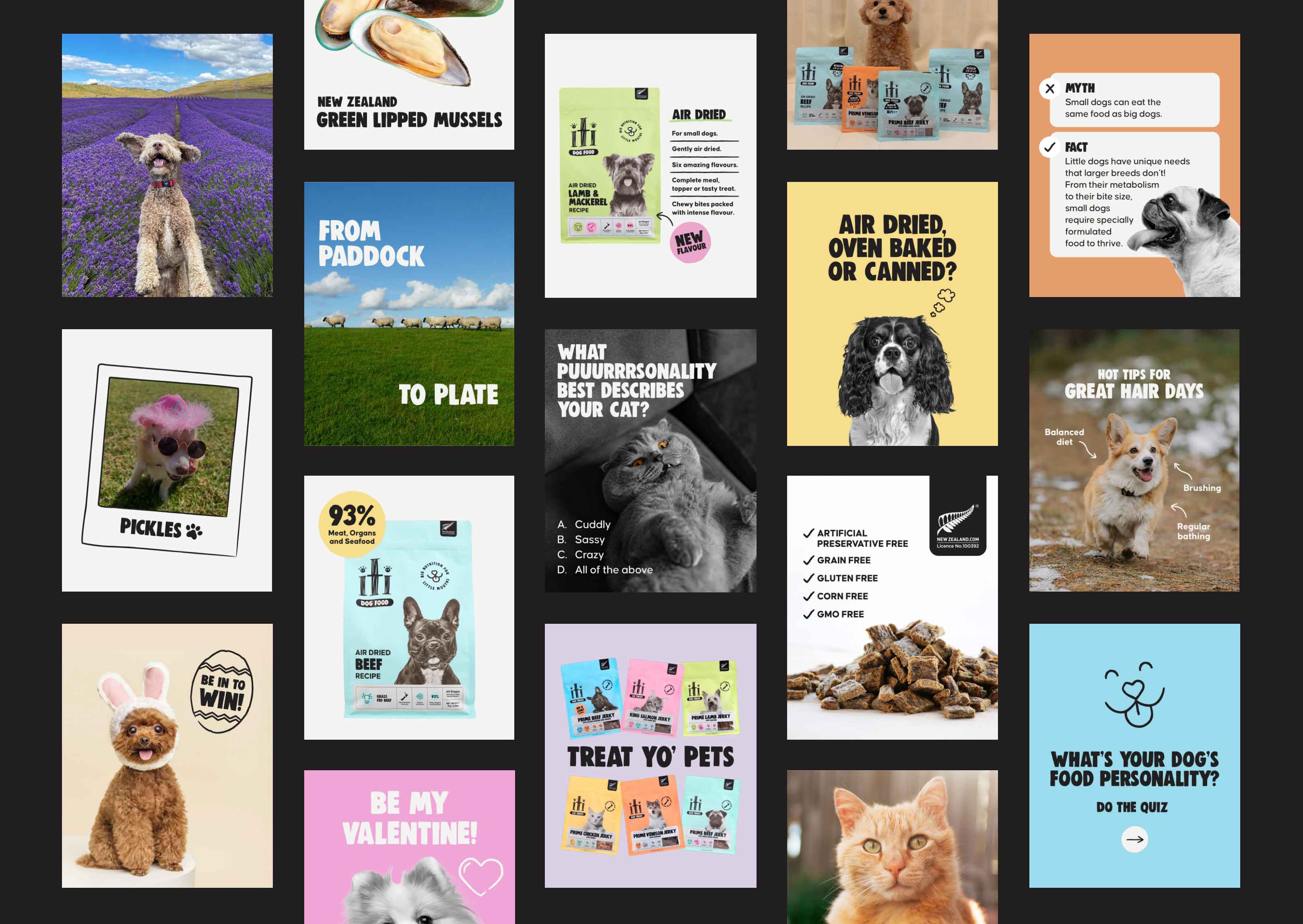
When iti noticed their latest packaging for their baked food range was becoming too similar to competitors, they realised they risked brand recognition loss. On top of this, their petfood packaging faced several other challenges, including inconsistent messaging, unintuitive messaging hierarchy and confusing design elements.
Our goal was to create a packaging refresh that would ensure customers could instantly identify the brand, product, flavour, and key benefits in just a few seconds, while making iti’s packaging more eye-catching in a crowded retail space.
A New Order
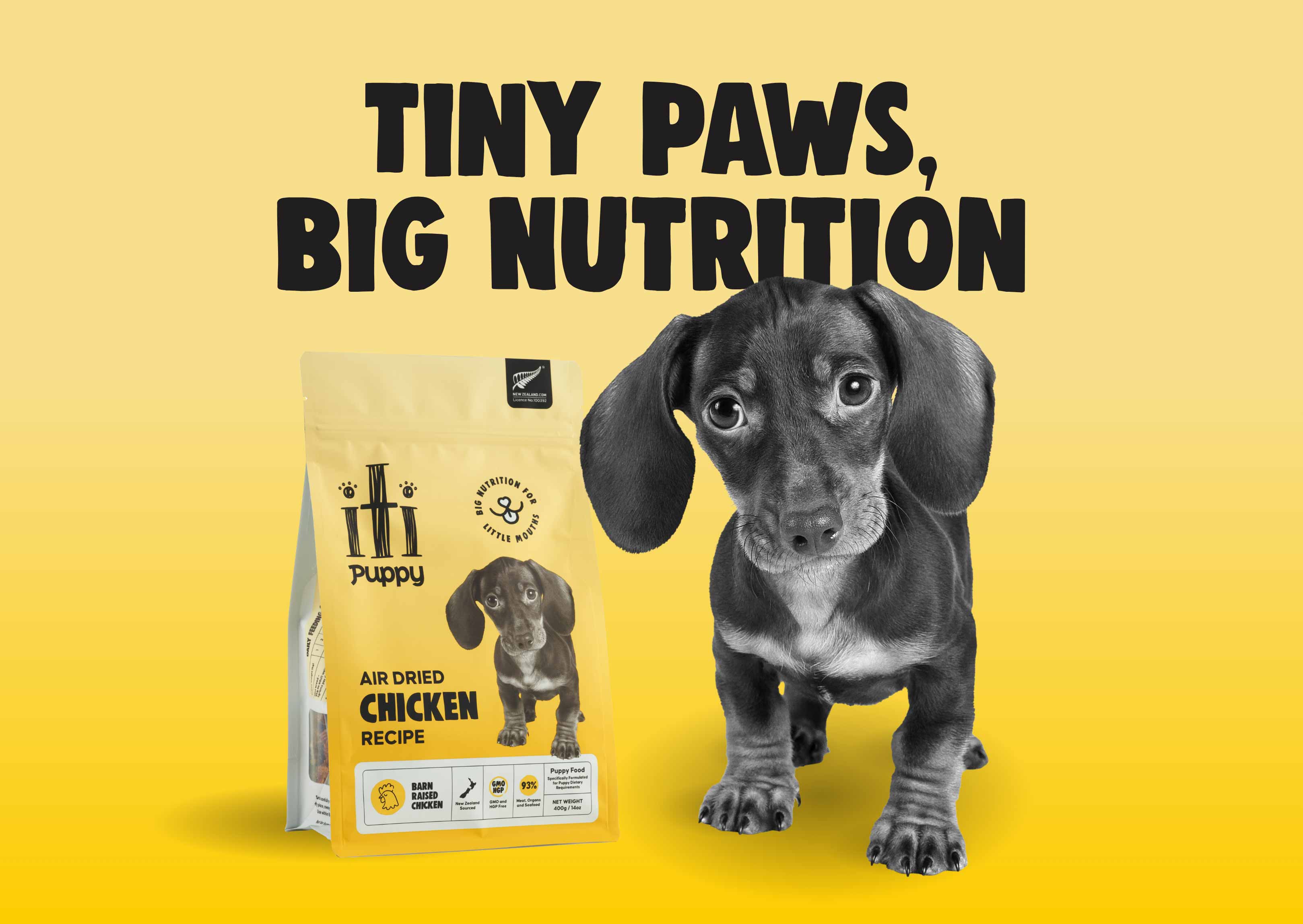
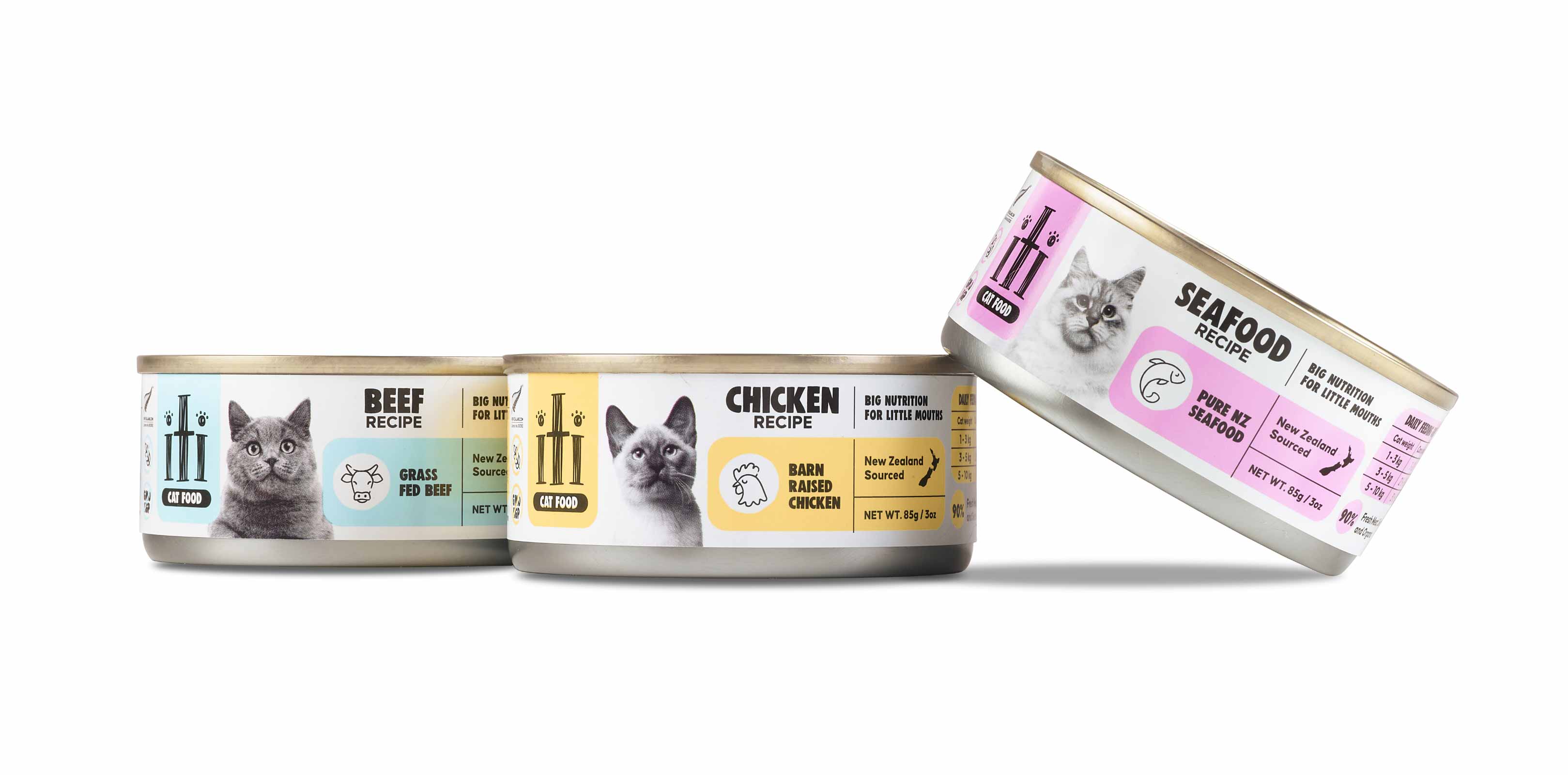
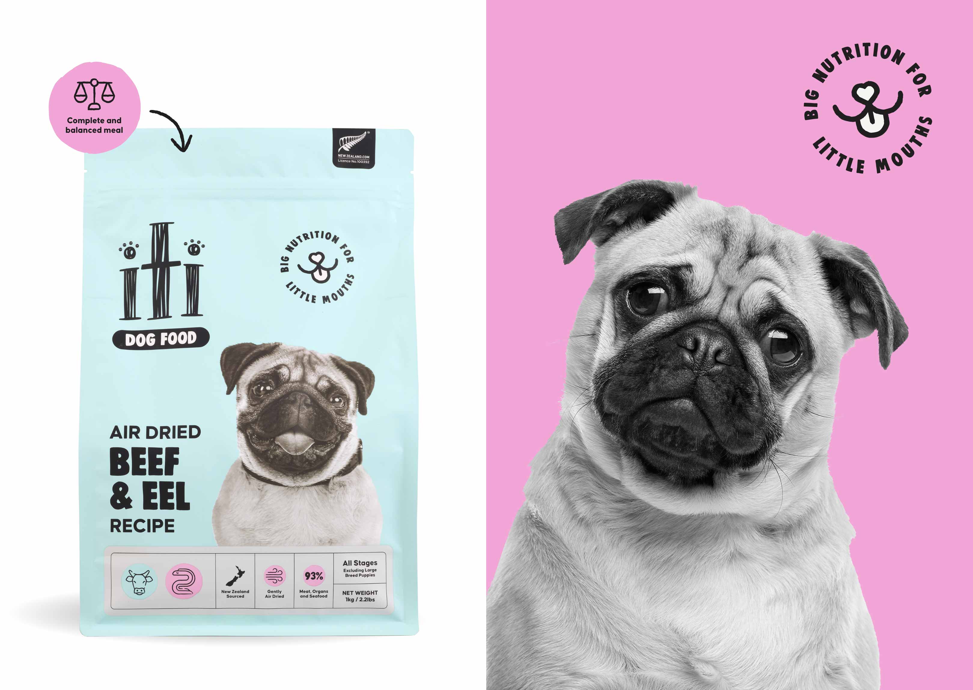
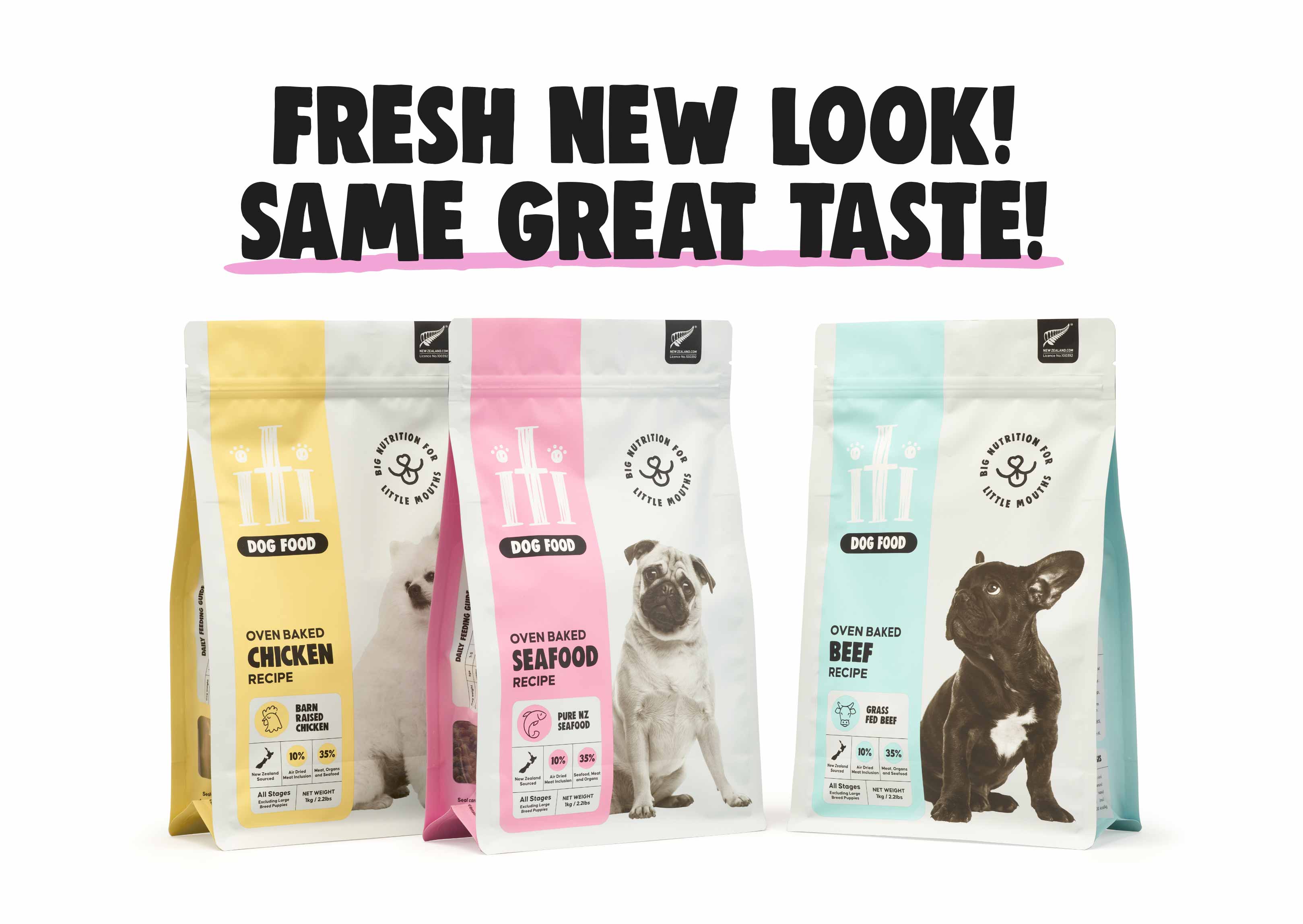
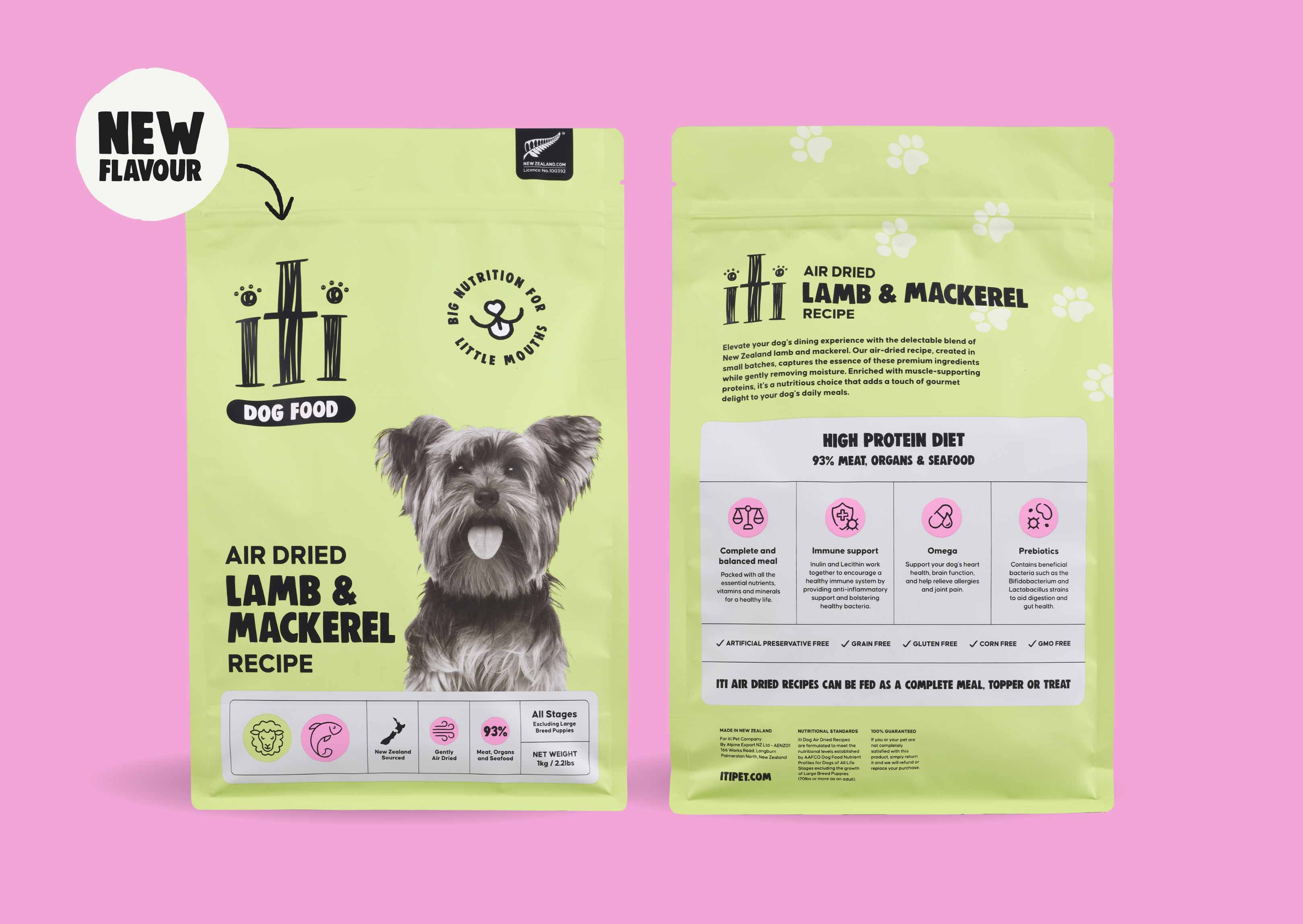
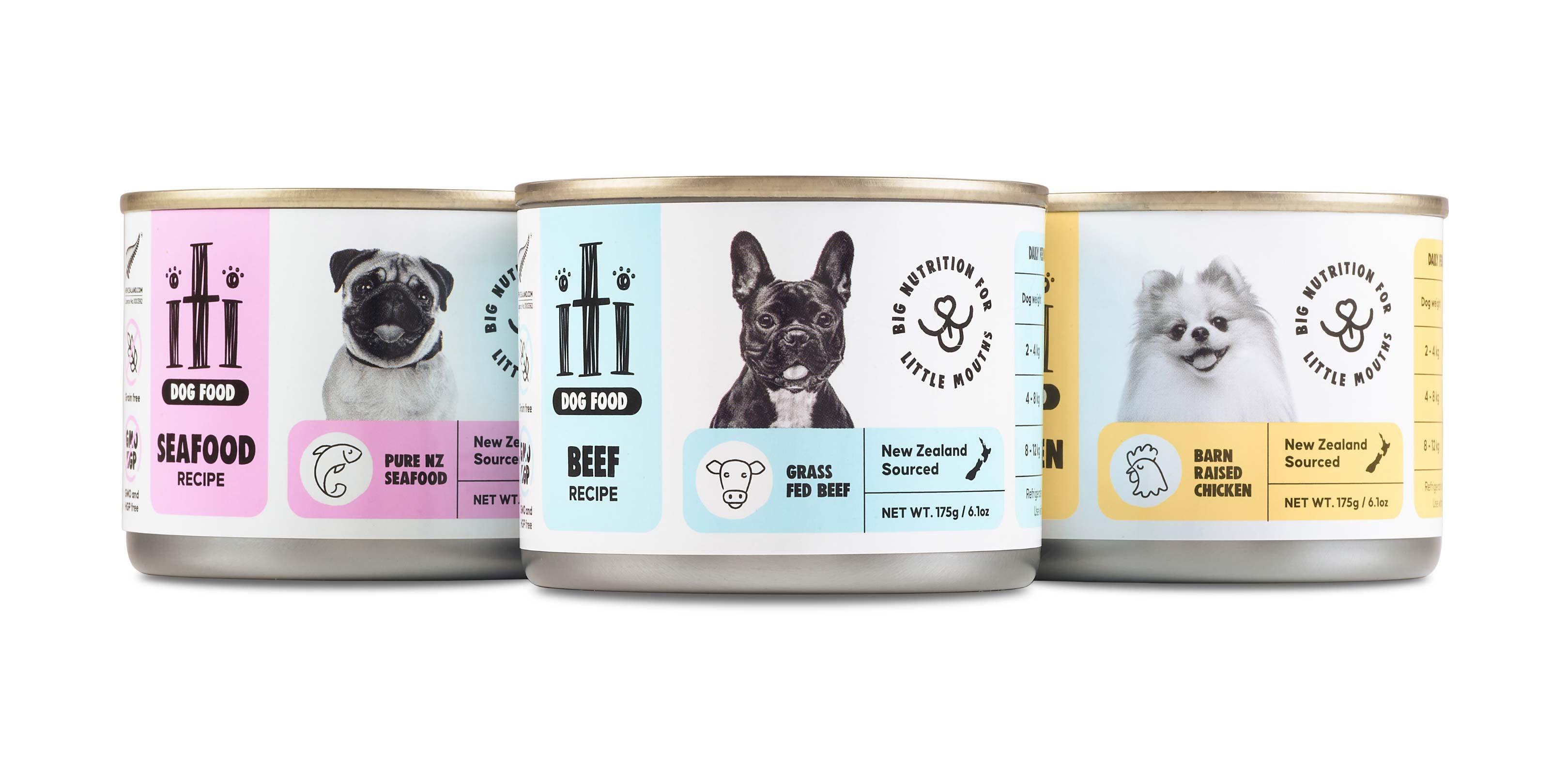
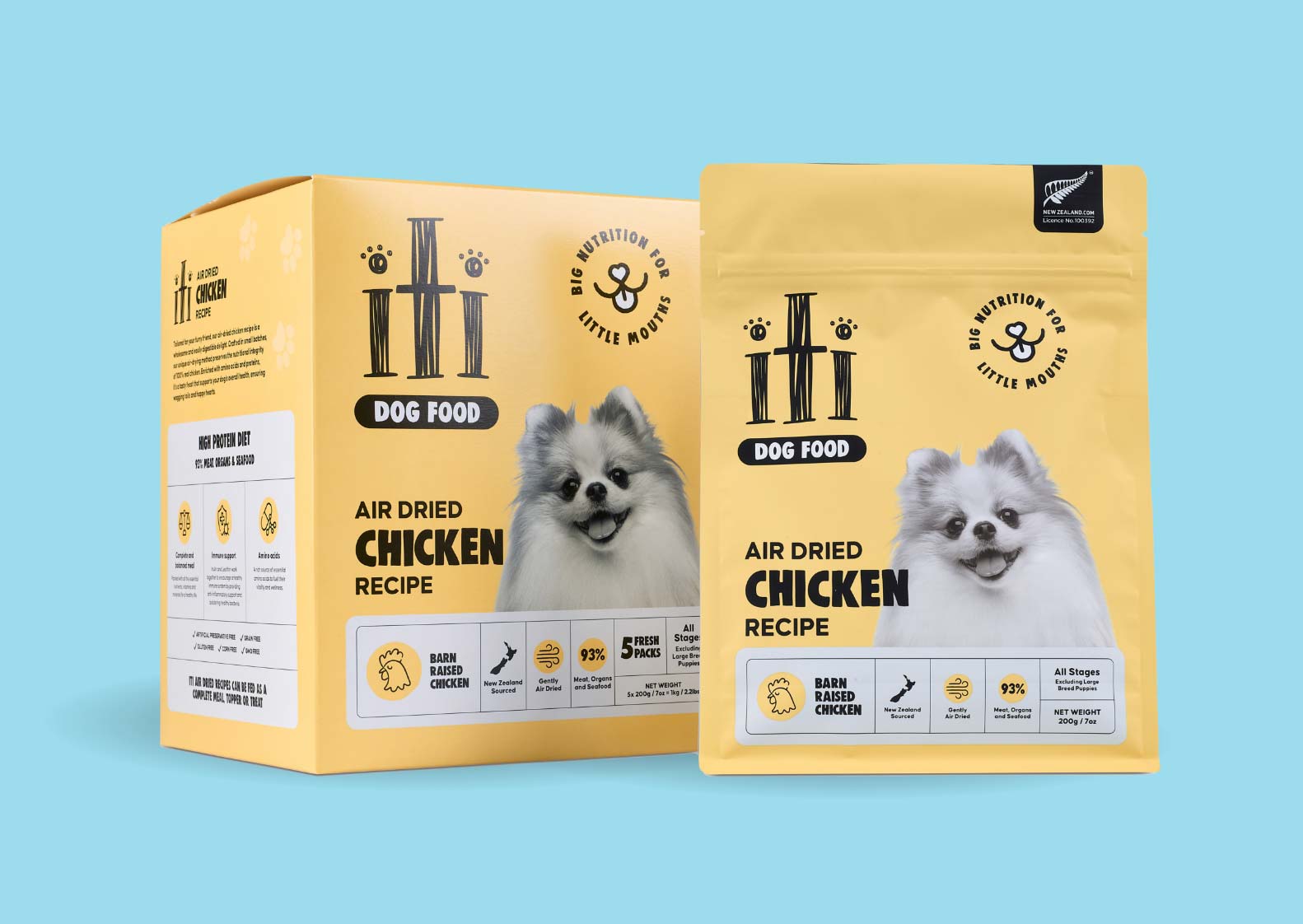
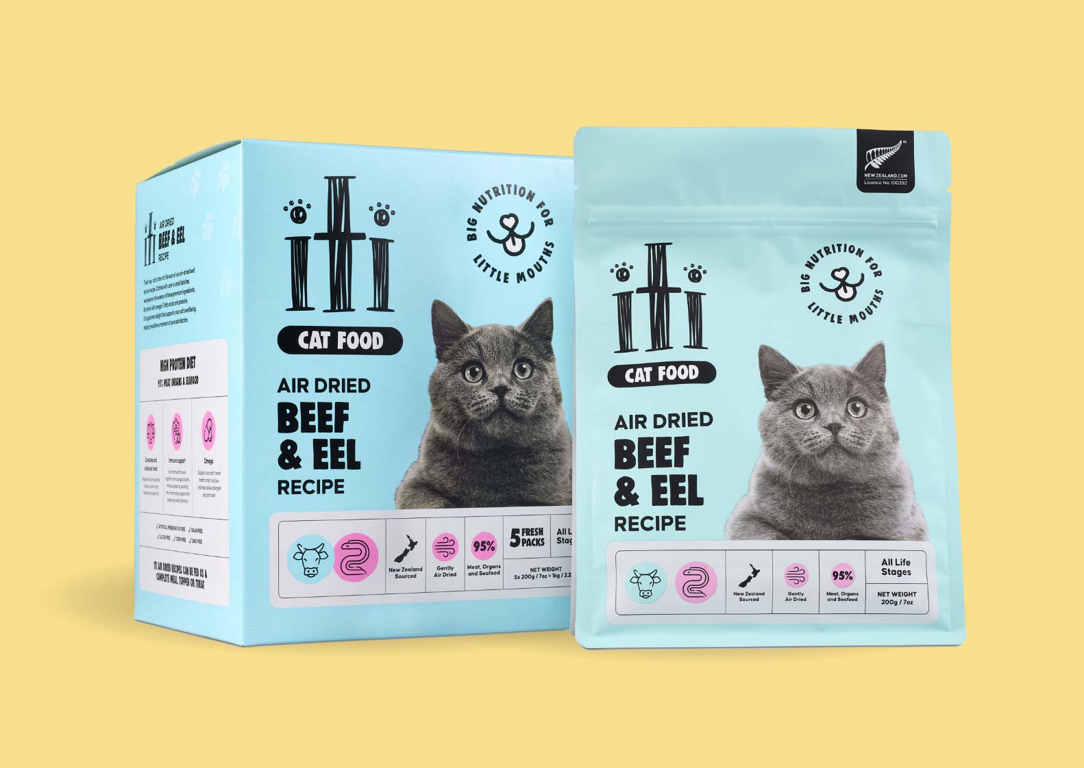
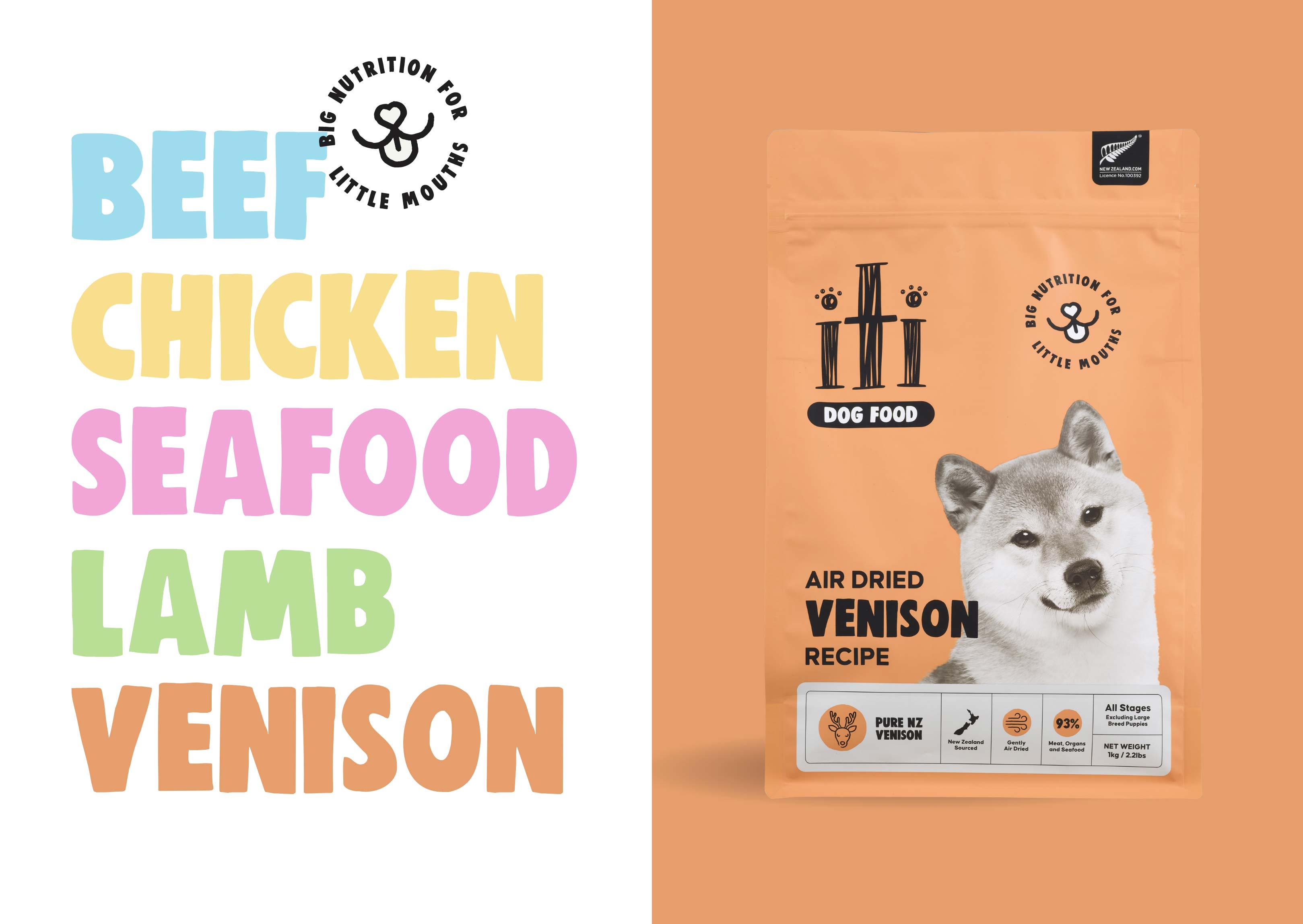
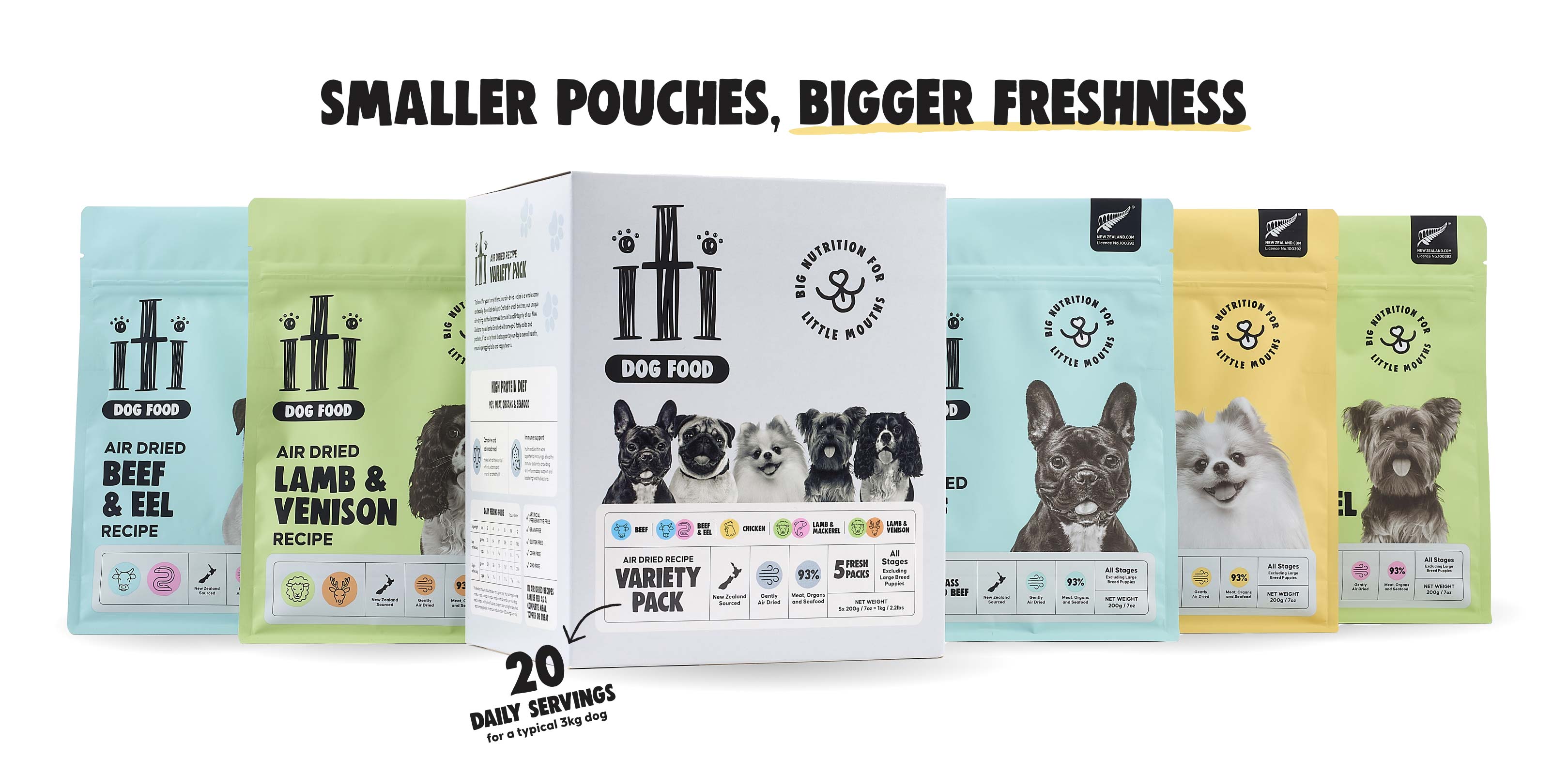
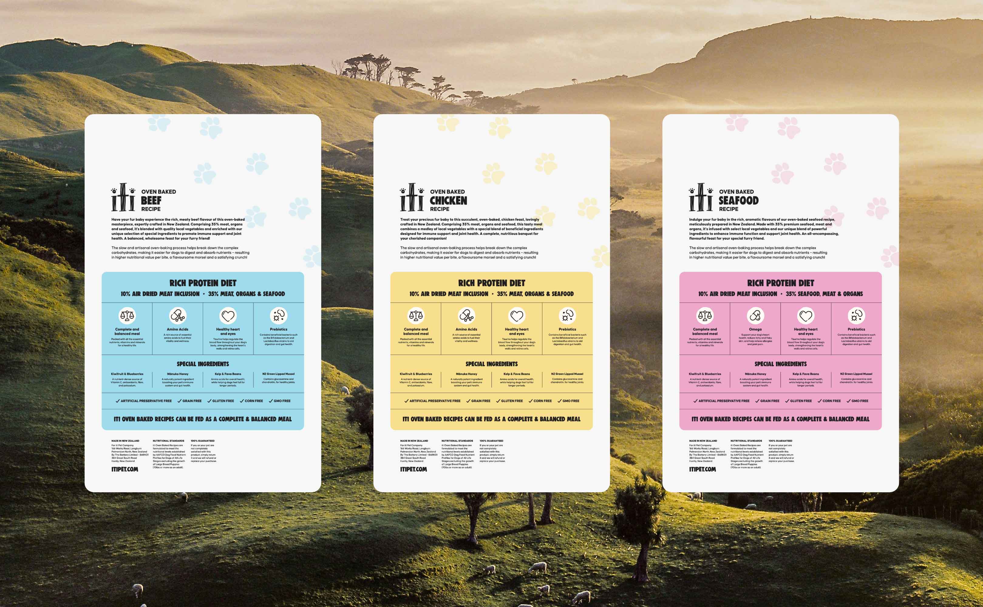
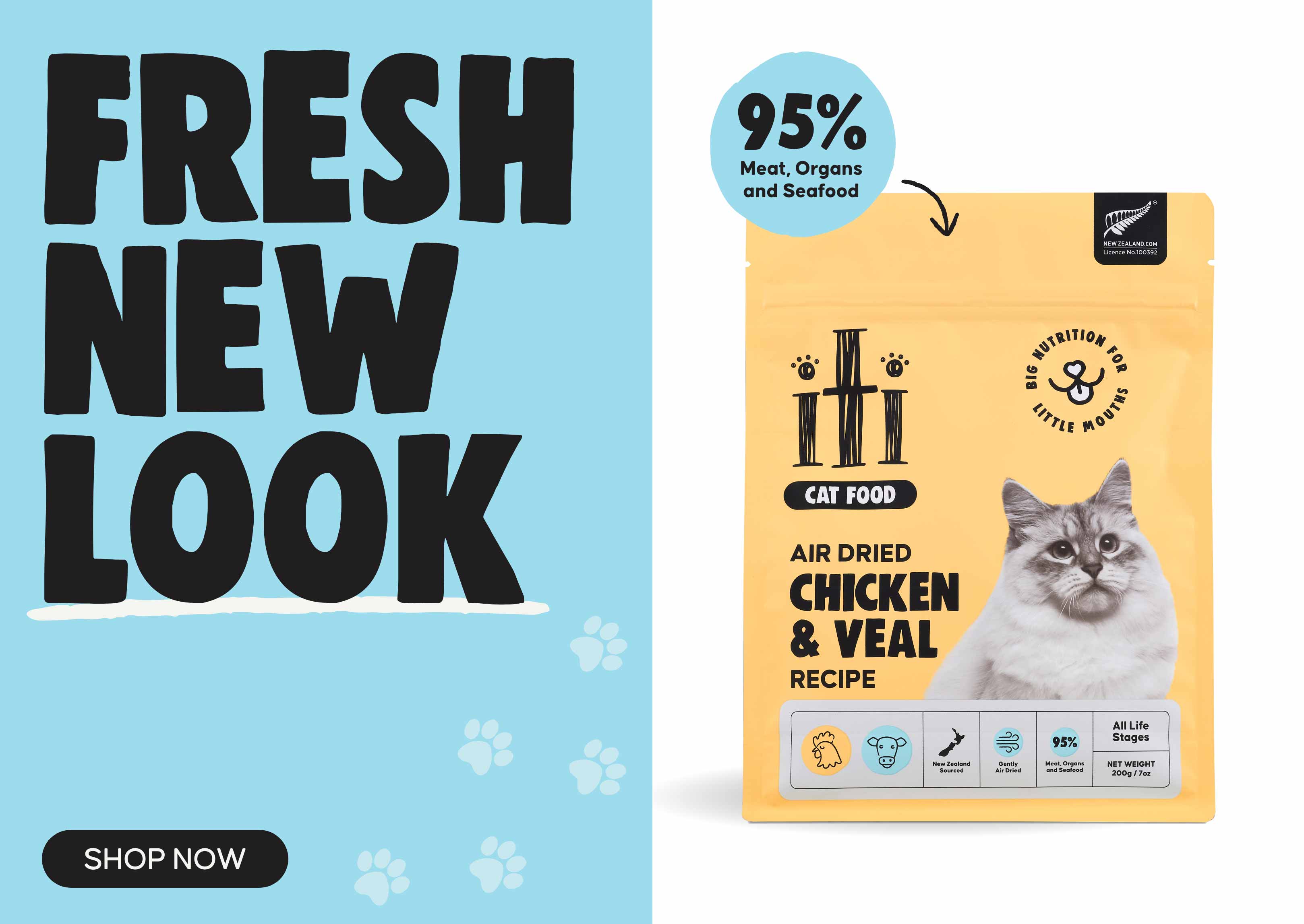
We restructured the packaging’s messaging to prioritise key information: who it’s from, what it is, and what the benefits are. The tagline, “Big nutrition for little mouths,” was standardised across all SKUs, while bold, large typography highlighted the dominant ingredient (e.g., Chicken & Salmon). Product descriptors and key benefits, such as Grain-Free and High-Protein, were simplified and made more legible.

Clearer Colour
We refined iti’s colour system by assigning distinct primary colours to each major flavour (e.g., Chicken, Salmon, Beef). This made it easier for customers to differentiate between variants at a glance. A secondary palette supported the primary colours to maintain a vibrant yet cohesive look.

Readable Typeface
To improve legibility, we selected a modern, bold typeface that was easy to read from a distance. Key information like product name, flavour, and benefits was made prominent, with secondary details remaining clear but less visually dominant.
Pet Fun
The imagery on iti’s packaging features vibrant, high-quality photos of the pets themselves – dogs or cats – enjoying the food. This engaging, animal-centric photography reinforced the emotional connection with pet owners, while also highlighting the freshness and quality of the ingredients.