With new owners, The Insulation Company was ready for a fresh start and a brand refresh to help them stand out in a crowded market. Our research insights were clear: the insulation industry is functional and highly competitive, but its communication is often dry and technical. There was an opportunity to break free from the norm and find the purpose behind the brand.
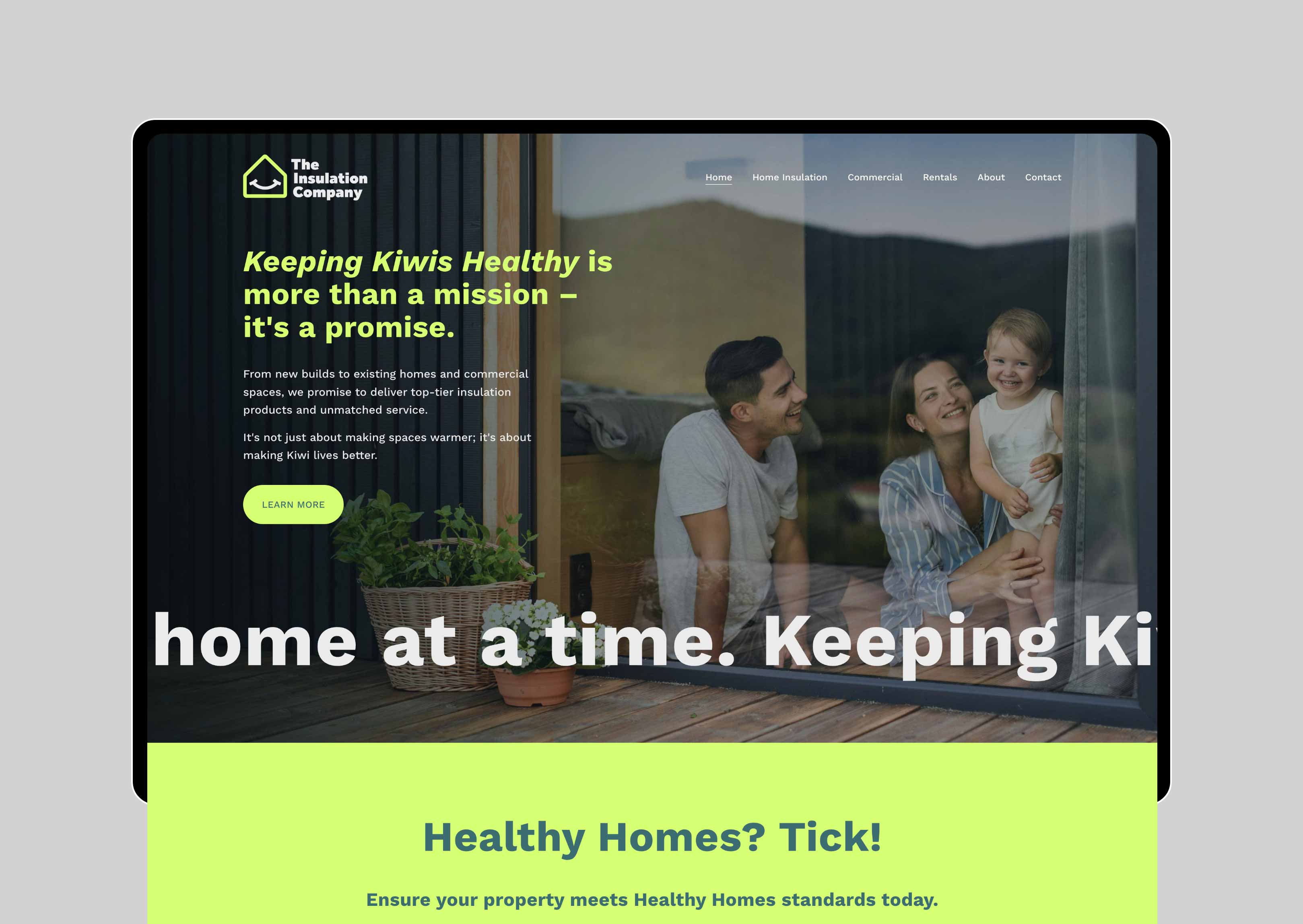
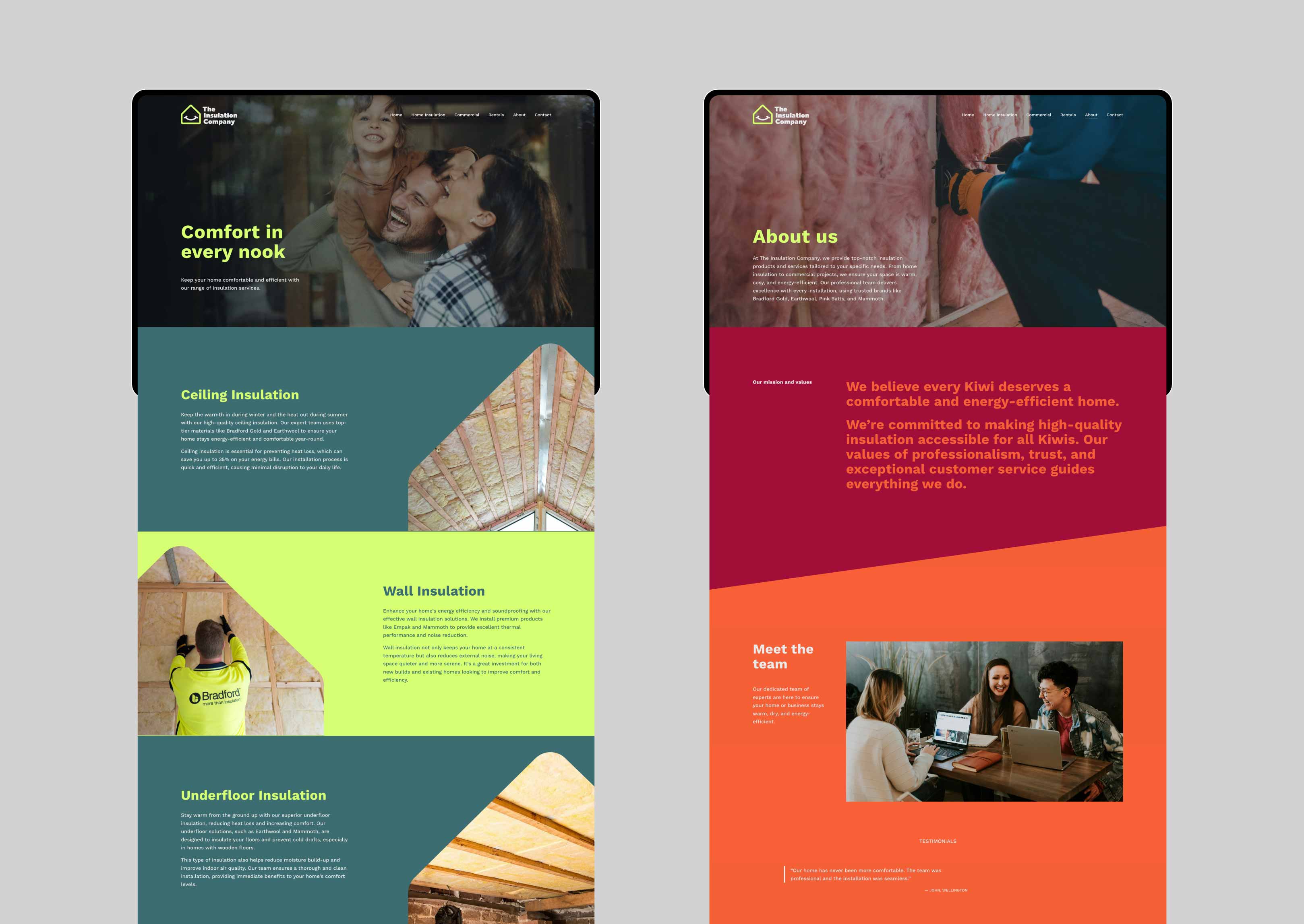
We positioned The Insulation Company as the go-to experts for creating healthier homes in New Zealand. By focusing on the emotional and functional benefits of insulation, the brand differentiated itself from competitors that relied solely on technical jargon. This positioning connected with both B2B clients, such as builders and property managers, and residential customers looking to create healthier, more comfortable homes.

A happy home
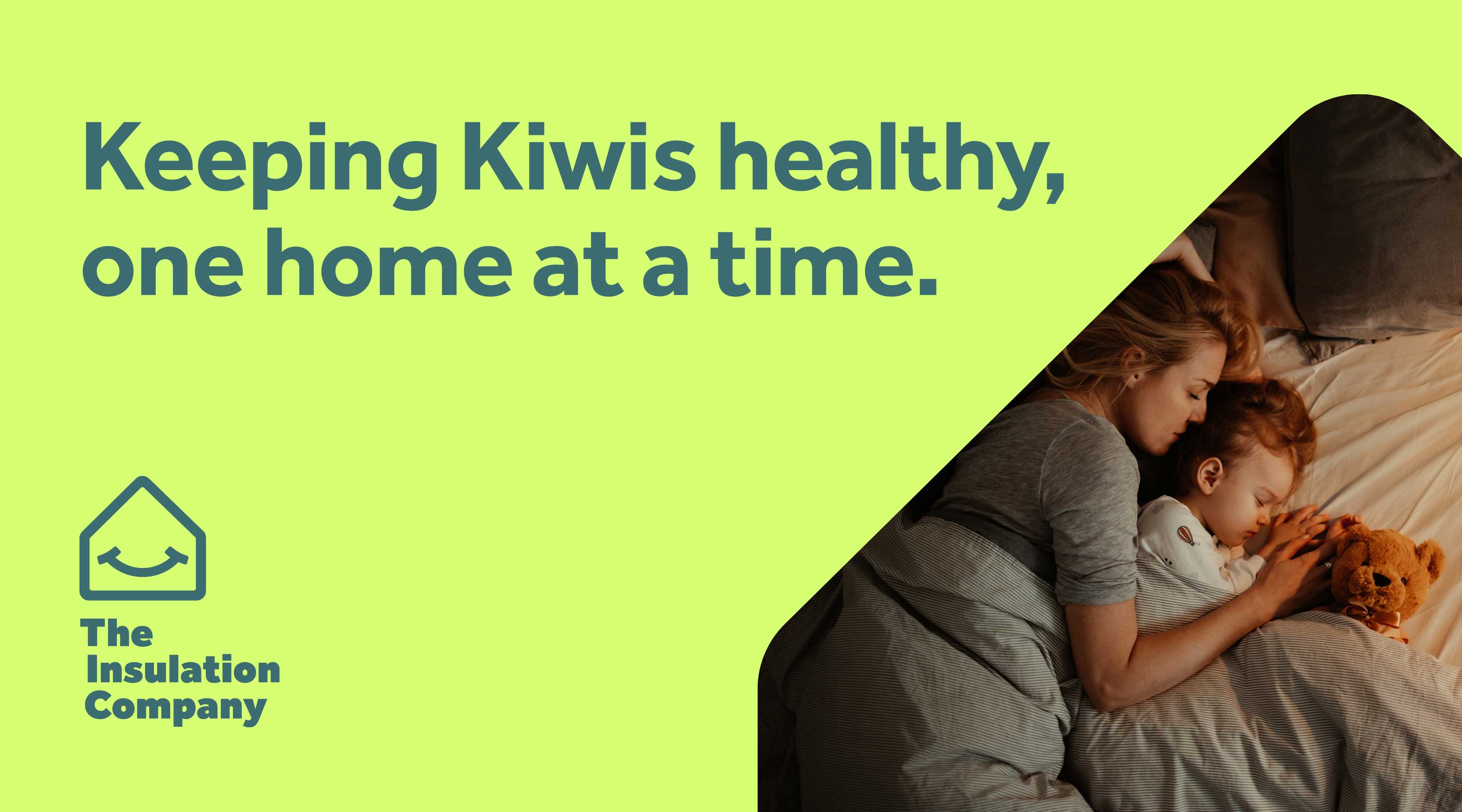
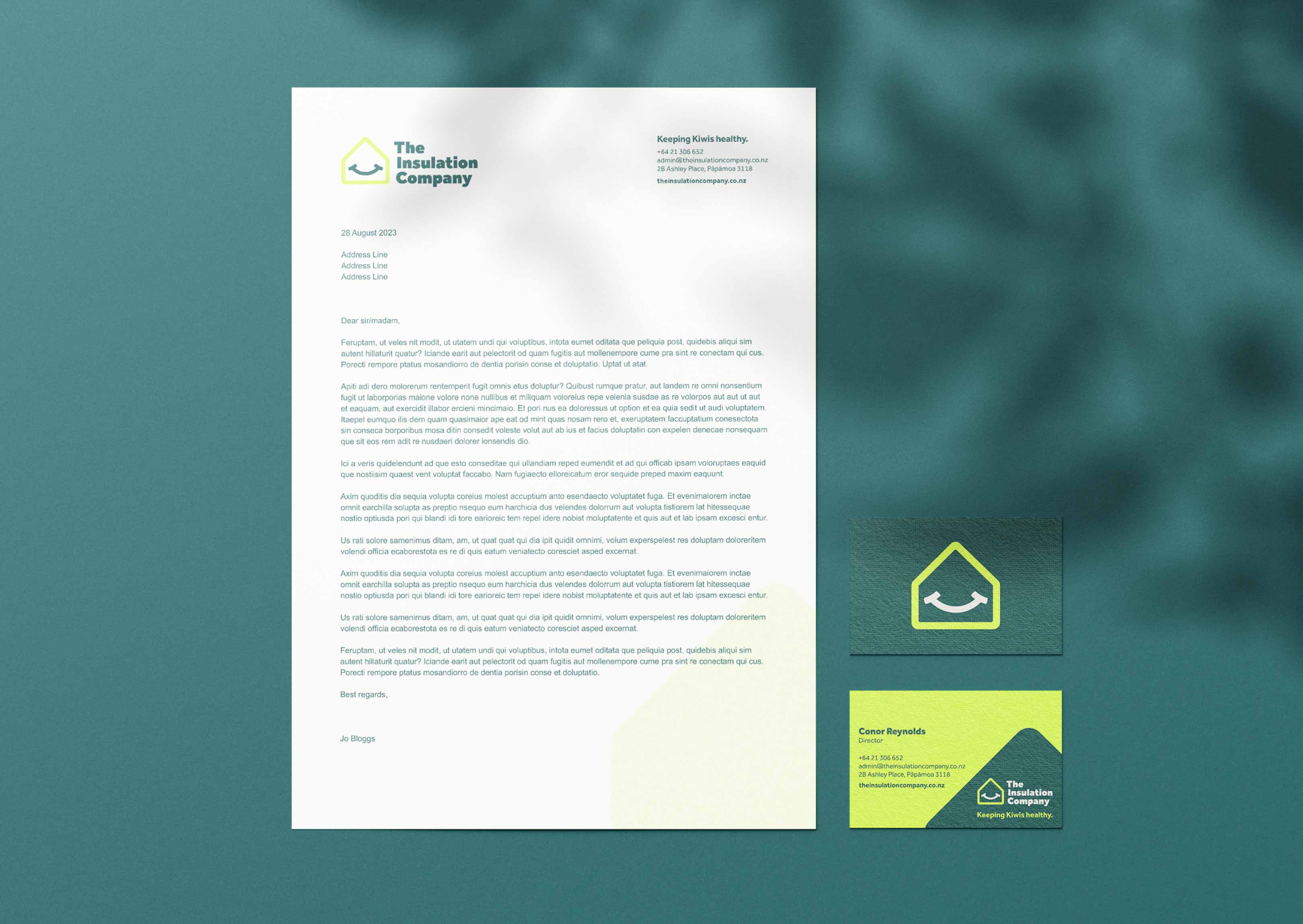
We designed an icon that reflects the brand purpose, rather than the functional side of insulation. The logomark sits at the heart of the identity; a symbol that represents happiness and warmth. As our home is central to our happiness, it should be filled with meaningful moments and special memories.

Bold, clear messaging
A bold yet approachable tone ensured the brand would stand out in a crowded market while maintaining trust with its audience. Messaging such as "Stay Cool," "Stay Toasty," and "Stay Quiet" simplified the benefits for easy communication, while phrases like "Keeping Kiwis Healthy" gave the brand a sense of purpose.


Dynamic colour
The colour palette avoided industry clichés and instead embraced vibrant blues, reds and greens. These refreshing colours reinforced the idea of health, comfort, and New Zealand’s environment, making the brand feel innovative and dynamic.


User-friendly site
The refreshed brand was rolled out across all touchpoints, including a new website and marketing materials. The website’s tone was direct yet inviting, with intuitive navigation and key messages delivered in big bold type.