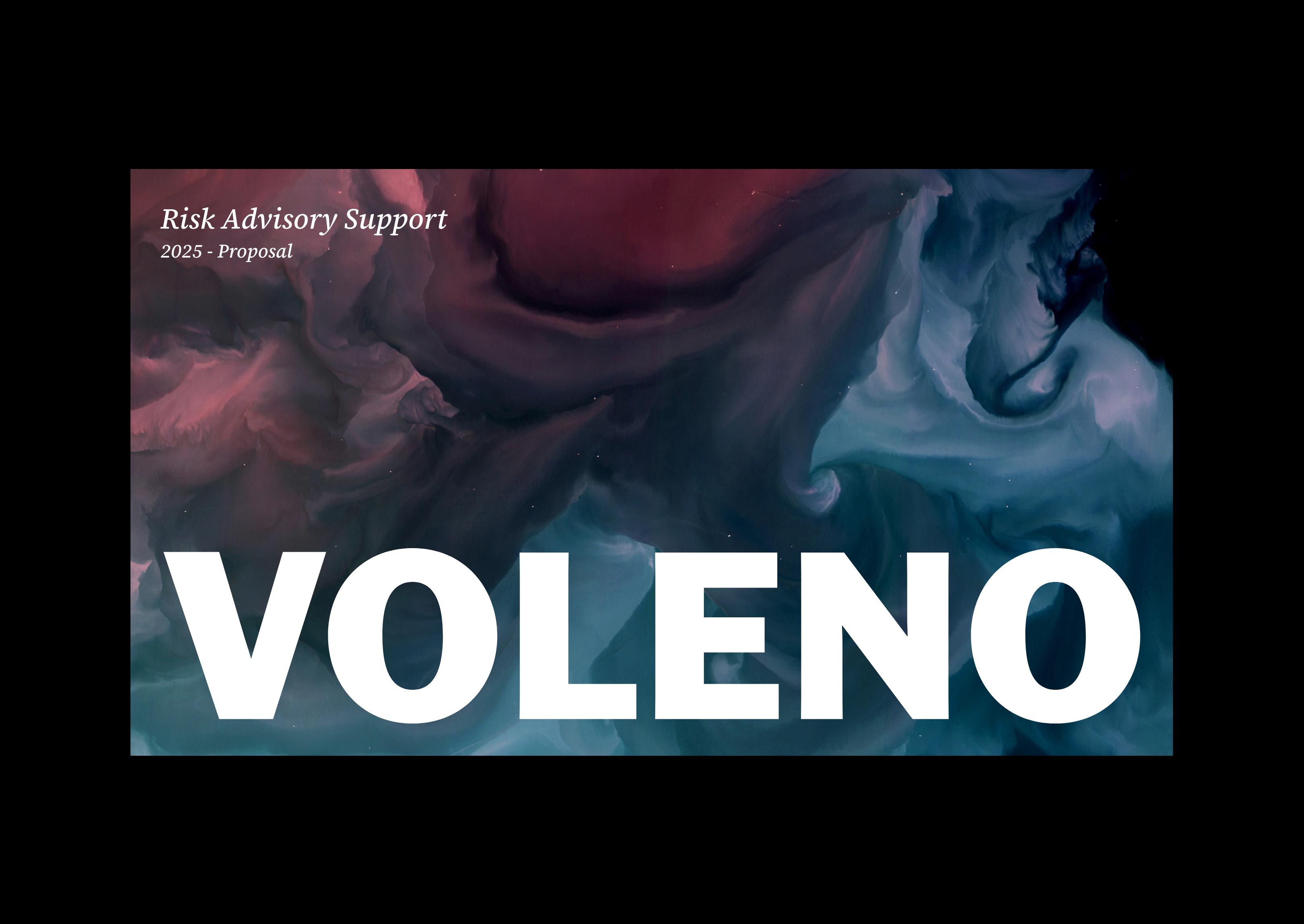
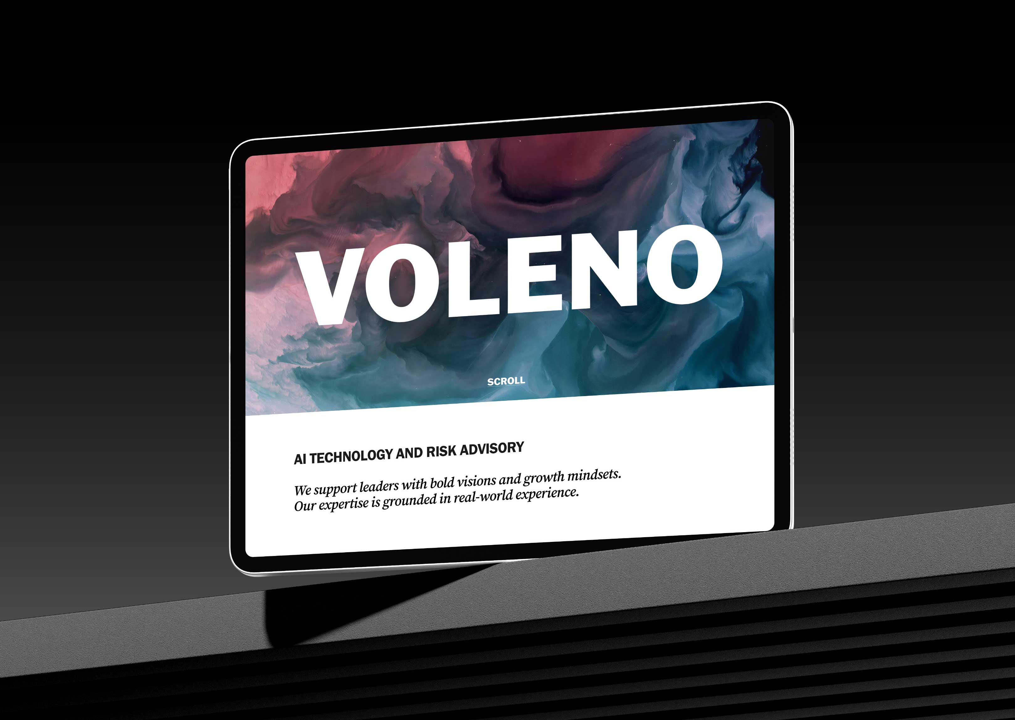
In a world saturated with noise, Voleno stands for clarity, purpose, and strategic foresight. As a firm advising on AI strategy, digital transformation, and risk management, it was critical that their visual language and brand positioning reflect not only expertise but making complexity feel accessible.
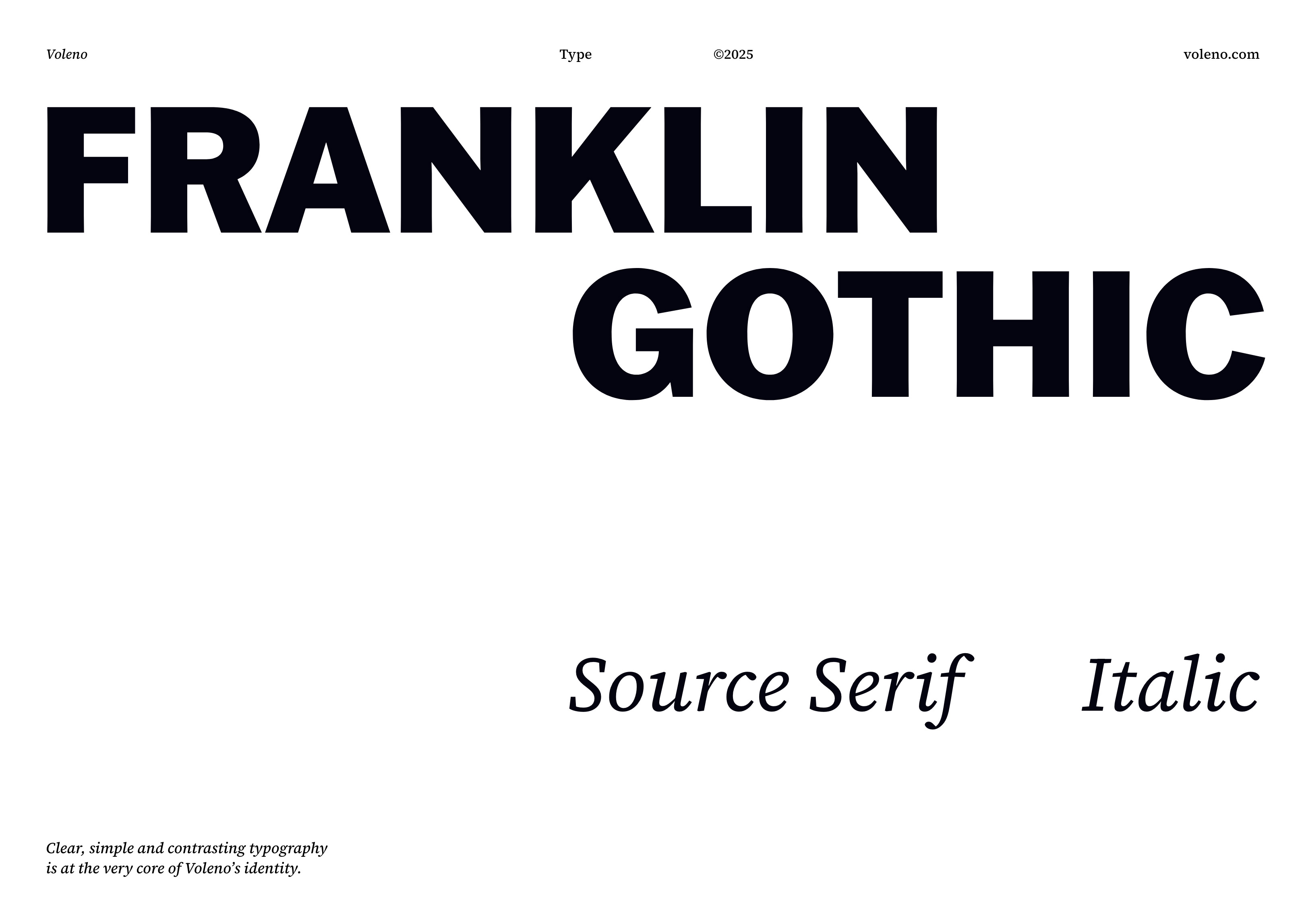
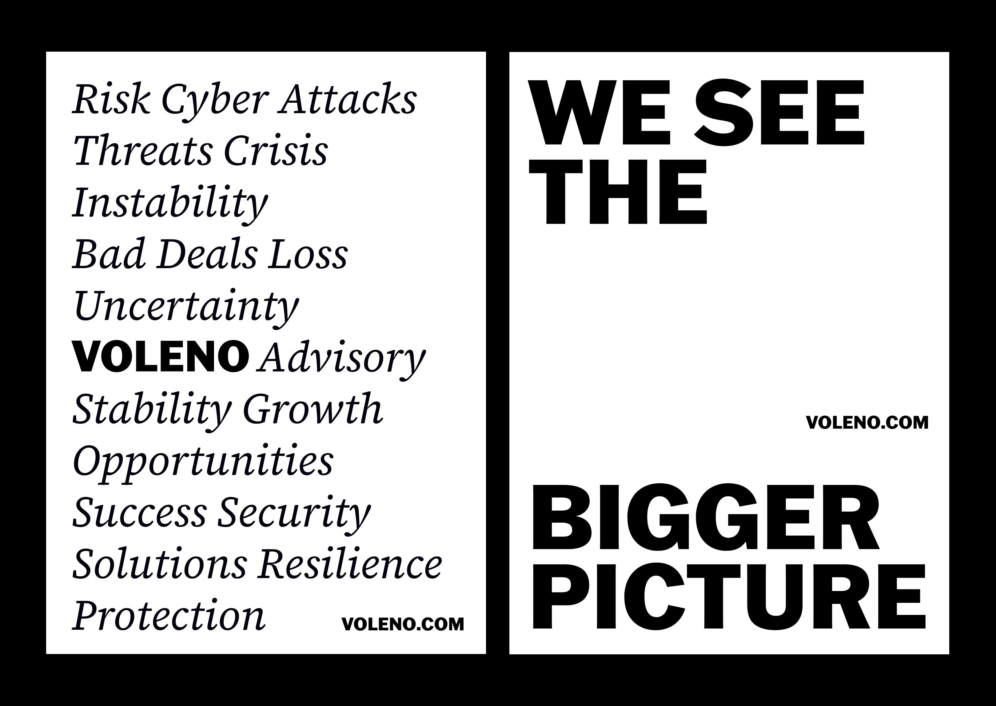
The core strategic belief underpinning this branding project is simplicity. Simplicity informed every creative decision, from typography and imagery to tone of voice and layout, resulting in a brand identity that communicates sophistication without overwhelm.
Simplicity with purpose
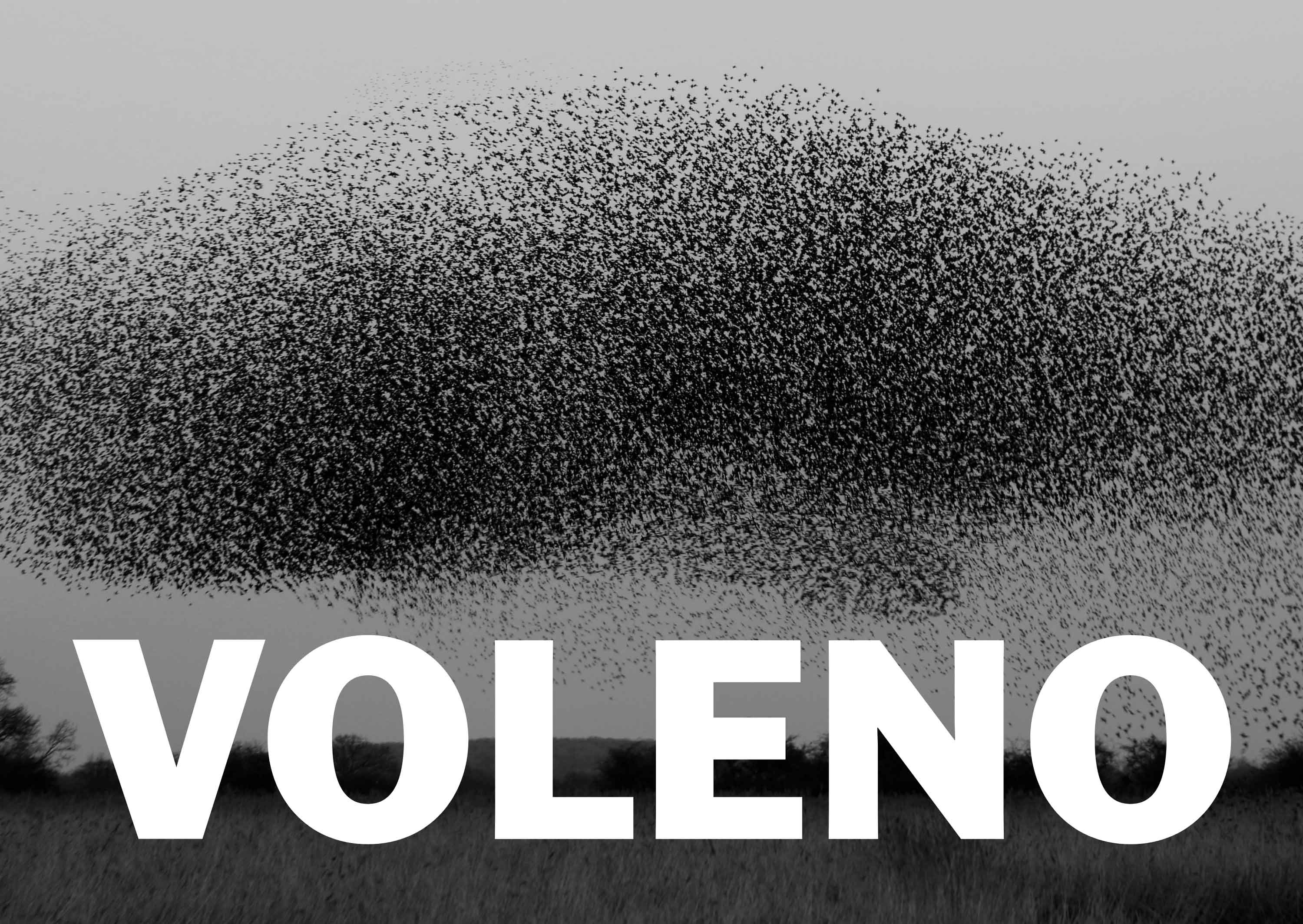
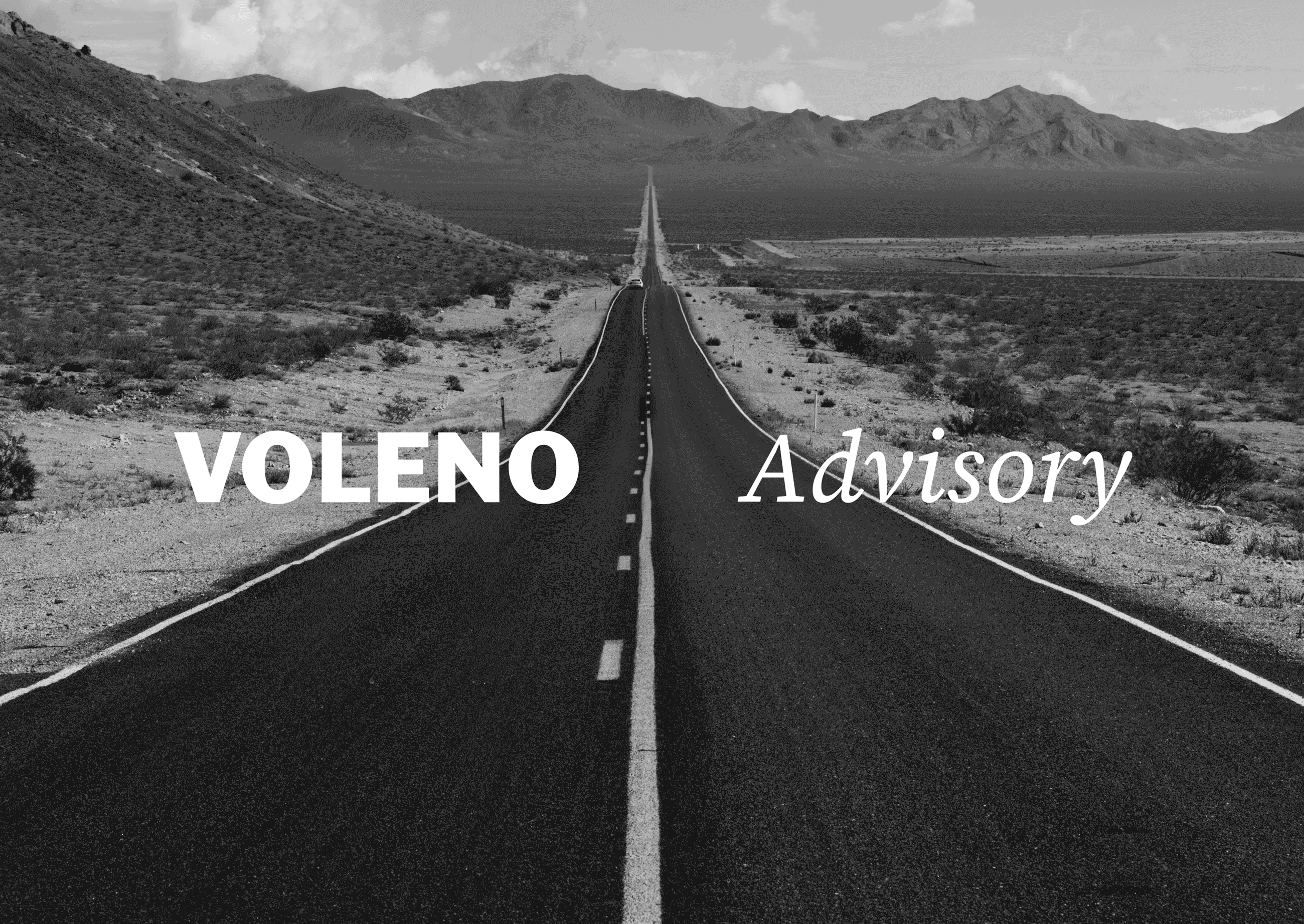
The brand uses minimalist black & white imagery and clean compositions that emphasize space, structure, and duality. This visual discipline mirrors Voleno’s analytical approach, where every choice is intentional, not ornamental.
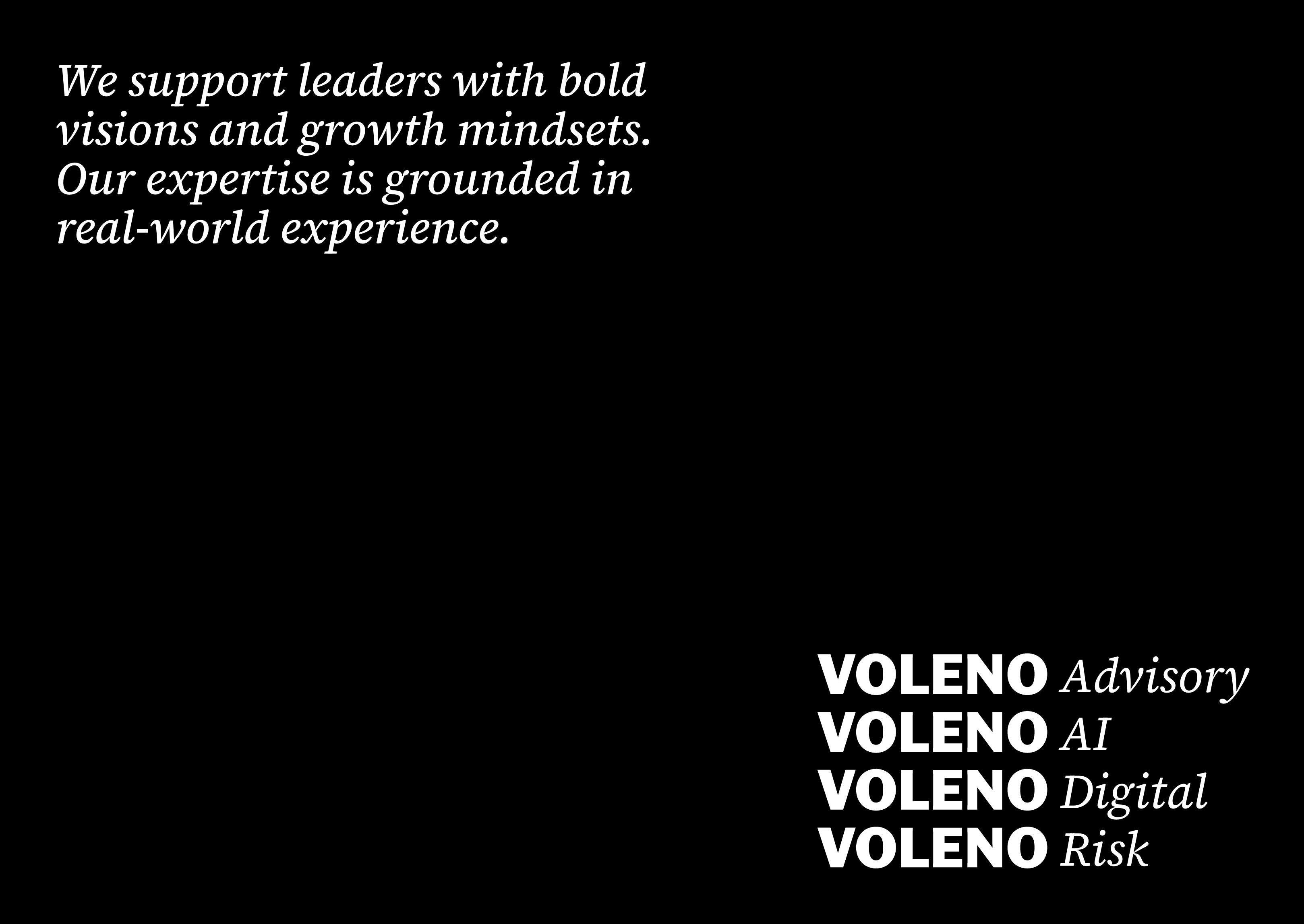


The final brand system centers on three pillars:
Clarity
Black and white imagery with crisp lines, geometric compositions, and architectural minimalism creates a coherent visual narrative, every image reinforces focus and purpose.
Sophistication
The choice of refined typography and disciplined layouts positions the brand as thoughtful and authoritative, aligning with executive-level strategy work.
Approachability
While informed by precision, the visual language avoids harshness. Rounded type details and generous space render the identity warm and human — inviting engagement rather than obscuring it.
Copy structure follows a “less is more” philosophy, prioritising purpose over filler, and meaning over noise.
Ultimately, the visual language and identity system translate Voleno’s ethos into a brand experience that is simple, sophisticated, and consistently clear, allowing audiences to instantly understand who Voleno is and why it matters.